CEL Syntax Glossary
Common Visual-Design Terms and Elements
Layout/Styling

Basics of a Web Page
Lorem ipsum dolor sit amet, consectetur adipiscing elit. Nunc sed velit eu sapien mollis tincidunt sit amet in massa. Curabitur ultrices pharetra dui, ut accumsan justo pretium ut. Maecenas consectetur in turpis at feugiat. Maecenas nec ipsum nibh. Donec eget mattis mauris. Phasellus fringilla lorem massa. Pellentesque iaculis massa odio, non pretium sem sollicitudin eget. Pellentesque habitant morbi tristique senectus et netus et malesuada fames ac turpis egestas. Curabitur gravida ante sit amet dolor ultricies, sed faucibus ligula interdum. Nulla libero augue, vulputate quis mollis vitae, feugiat quis odio.
Learning Environments
LEARN

Lorem ipsum dolor sit amet, consectetur adipiscing elit. Nunc sed velit eu sapien mollis tincidunt sit amet in massa. Curabitur ultrices pharetra dui, ut accumsan justo pretium ut. Maecenas consectetur in turpis at feugiat. Maecenas nec ipsum nibh. Donec eget mattis mauris. Phasellus fringilla lorem massa. Pellentesque iaculis massa odio, non pretium sem sollicitudin eget. Pellentesque habitant morbi tristique senectus et netus et malesuada fames ac turpis egestas. Curabitur gravida ante sit amet dolor ultricies, sed faucibus ligula interdum. Nulla libero augue, vulputate quis mollis vitae, feugiat quis odio.
CMS

Lorem ipsum dolor sit amet, consectetur adipiscing elit. Nunc sed velit eu sapien mollis tincidunt sit amet in massa. Curabitur ultrices pharetra dui, ut accumsan justo pretium ut. Maecenas consectetur in turpis at feugiat. Maecenas nec ipsum nibh. Donec eget mattis mauris. Phasellus fringilla lorem massa. Pellentesque iaculis massa odio, non pretium sem sollicitudin eget. Pellentesque habitant morbi tristique senectus et netus et malesuada fames ac turpis egestas. Curabitur gravida ante sit amet dolor ultricies, sed faucibus ligula interdum. Nulla libero augue, vulputate quis mollis vitae, feugiat quis odio.
Mobius

Lorem ipsum dolor sit amet, consectetur adipiscing elit. Nunc sed velit eu sapien mollis tincidunt sit amet in massa. Curabitur ultrices pharetra dui, ut accumsan justo pretium ut. Maecenas consectetur in turpis at feugiat. Maecenas nec ipsum nibh. Donec eget mattis mauris. Phasellus fringilla lorem massa. Pellentesque iaculis massa odio, non pretium sem sollicitudin eget. Pellentesque habitant morbi tristique senectus et netus et malesuada fames ac turpis egestas. Curabitur gravida ante sit amet dolor ultricies, sed faucibus ligula interdum. Nulla libero augue, vulputate quis mollis vitae, feugiat quis odio.

Lorem ipsum dolor sit amet, consectetur adipiscing elit. Nunc sed velit eu sapien mollis tincidunt sit amet in massa. Curabitur ultrices pharetra dui, ut accumsan justo pretium ut. Maecenas consectetur in turpis at feugiat. Maecenas nec ipsum nibh. Donec eget mattis mauris. Phasellus fringilla lorem massa. Pellentesque iaculis massa odio, non pretium sem sollicitudin eget. Pellentesque habitant morbi tristique senectus et netus et malesuada fames ac turpis egestas. Curabitur gravida ante sit amet dolor ultricies, sed faucibus ligula interdum. Nulla libero augue, vulputate quis mollis vitae, feugiat quis odio.
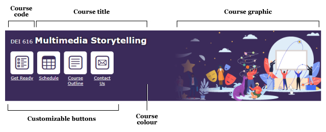
Banners
Course Banner
Welcome Widget
Typography
Typeface
“A collection of characters that share a common design” (Malamed, 2015, p. 104)
Four basic type classifications:
Serif
have small feet at the end of the strokes
(e.g., Georgia)
Sans Serif
without little feet
(e.g., Arial)
Script
similar to handwriting
Decorative
Mono

Font
“A complete character set of a single style” (Malamed, 2015, p. 104), such as Arial, Helvetica, Times New Roman. A font is one variant of a typeface. A typeface is a family of fonts.
Web safe
The following list are the best web safe fonts for HTML and CSS:
- Arial (sans-serif)
- Verdana (sans-serif)
- Helvetica (sans-serif)
- Tahoma (sans-serif)
- Trebuchet MS (sans-serif)
- Times New Roman (serif)
- Georgia (serif)
- Garamond (serif)
- Courier New (monospace)
- Brush Script MT (cursive)
Web fonts
CSS allows you to specify font files, available on the web, to be downloaded along with your website as it's accessed. This means that any browser supporting this CSS feature can display the fonts you've specifically chosen.
Examples
- Almost before we knew it, we had left the ground.
- Almost before we knew it, we had left the ground.
- Almost before we knew it, we had left the ground.
Font Weights
- Bold/strong (font-weight)
- 100
- 200
- 300
- 400
- 500
- 600
- 700
- 800
- 900
- Italic
- Underline: Use for hyperlinks only
- Highlight
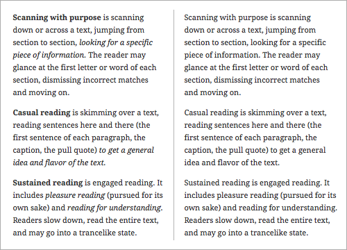
Sentence here outlining difference between using weight/italics to highlight content (left) instead of the more narrative approach of plain text (right)
Paragraph
Lorem ipsum dolor sit amet, consectetur adipiscing elit. Nunc sed velit eu sapien mollis tincidunt sit amet in massa. Curabitur ultrices pharetra dui, ut accumsan justo pretium ut. Maecenas consectetur in turpis at feugiat. Maecenas nec ipsum nibh. Donec eget mattis mauris. Phasellus fringilla lorem massa. Pellentesque iaculis massa odio, non pretium sem sollicitudin eget. Pellentesque habitant morbi tristique senectus et netus et malesuada fames ac turpis egestas. Curabitur gravida ante sit amet dolor ultricies, sed faucibus ligula interdum. Nulla libero augue, vulputate quis mollis vitae, feugiat quis odio.
Images

Raster Images
Also know as bitmap, such as photographs, store colour information in pixels
When enlarged, they will lose quality

Common formats:


Vector images
Such as digital illustrations which are created from mathematical descriptions
When resized, they will not lose quality

Common formats:


| Image Type | Example |
|---|---|
| Photographs | |
| Illustrations |
|
| 3D Models |
|
| Icons |
|
| Graphics (charts, diagrams) |
|
| Infographics |
|
Common Website Elements
| Element | Example |
|---|---|
| Accordion/Collapsible |
This is the first item's accordion body. It is shown by
default, until the collapse plugin adds the appropriate classes that we
use to style each element. These classes control the overall appearance,
as well as the showing and hiding via CSS transitions. You can modify
any of this with custom CSS or overriding our default variables. It's
also worth noting that just about any HTML can go within the
.accordion-body, though the transition does limit overflow.
This is the second item's accordion body. It is hidden
by default, until the collapse plugin adds the appropriate classes that
we use to style each element. These classes control the overall
appearance, as well as the showing and hiding via CSS transitions. You
can modify any of this with custom CSS or overriding our default
variables. It's also worth noting that just about any HTML can go within
the
.accordion-body, though the transition does limit
overflow.
This is the third item's accordion body. It is hidden
by default, until the collapse plugin adds the appropriate classes that
we use to style each element. These classes control the overall
appearance, as well as the showing and hiding via CSS transitions. You
can modify any of this with custom CSS or overriding our default
variables. It's also worth noting that just about any HTML can go within
the
.accordion-body, though the transition does limit
overflow.
|
| Alert |
A simple primary alert—check it out!
A simple secondary alert—check it out!
A simple success alert—check it out!
A simple danger alert—check it out!
A simple warning alert—check it out!
A simple info alert—check it out!
A simple light alert—check it out!
A simple dark alert—check it out!
|
| Blockquote |
|
| Breadcrumb (navigation) | |
| Callout | |
| Card |
Card titleSome quick example text to build on the card title and make up the bulk of the card's content. Go somewhere |
| Carousel (Not available in Mobius) |
|
| Label | Primary Secondary Success Danger Warning Info Light Dark |
| MathJax A JavaScript display engine for mathematics that works in all browsers. |
When \(a \ne 0\), there are two solutions to \(ax^2 + bx + c = 0\) and they are \[x = {-b \pm \sqrt{b^2-4ac} \over 2a}.\] |
| Modal (pop-up window) | |
| Pagination | |
| Panel/callout |
Header
Primary card titleSome quick example text to build on the card title and make up the bulk of the card's content. Header
Secondary card titleSome quick example text to build on the card title and make up the bulk of the card's content. Header
Success card titleSome quick example text to build on the card title and make up the bulk of the card's content. |
| Popover | |
| Progress Bar |
|
| Tabs |
...
...
...
|
| Tooltips |
Also see Contensis Interactive Elements and W3Schools How To for more design ideas